UX Design - Mentor & Author.
7 Jan, 2023

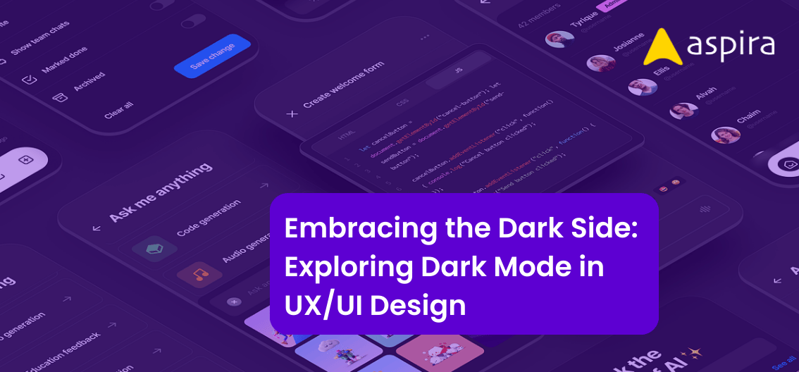
Dark themes have quickly become a popular design trend in the world of UI design in the last two years. In recent years, dark themes have been popping up on websites, applications and operating systems. They provide a sleek and modern look to any digital experience. With their minimalistic aesthetic, dark themes can enhance the look and feel of an interface. They also create a sense of sophistication and modernity. But dark themes are much more than just a trendy aesthetic choice, they come with a range of UX and UI design best practices that should be considered for any design project. In this article, we’ll explore why dark themes are so popular, and discuss how to use and implement them to create a seamless and impactful user experience.
Dark Themes Best Practices
Do Users Spend a Lot of Time on the App?
When it comes to design, making the best choices for user experience is key. That’s why when it comes to dark themes, they can be particularly helpful if you have an app that users will spend a lot of time on.
Using white as your background colour in any interface can be too bright and may cause users to disengage more quickly due to eye strain. However, using dark shades can provide an inviting visual experience and even relax users’ eyes over time.
So if you have an application with long user sessions, dark themes are definitely something to consider when designing your interface. Designers should use dark shades purposefully considering contrast levels and lighter elements that fit into each page layout pattern. This will help create easier navigation experiences for users who want to interact with the pages for prolonged periods of time.
Dark themes are also great for applications where data consumption is involved such as management tools or streaming services since it can mask off other distractions from the interface so your users can focus better on their tasks at hand.
Programmers or Developers Like Dark Themes

Programmers and developers both perform a very important job in creating applications, but they have different needs when it comes to UX/UI design. Developers spend upwards of 8-12 hours a day working on their coding environment, so their preference would be a darker theme that is easier on the eyes after long periods of staring at screens.
In fact, dark themes were originally created with the programmer community in mind. It was designed for its more muted color palette to help reduce eyestrain and fatigue from being exposed to harsh light reflecting off digital screens. It is believed that dark modes help keep one more focused and productive by reducing distractions from vivid colors found in other themes.
Traders Benefit from Dark-themed Apps

Dark themes are not only used by developers in their coding environment, but they are also popular with app traders. This is because they spend 8-12 hours daily on their trading platform, and the dark background has proven to be a better option than the traditional lighter colored backgrounds.
Traders benefit from dark themes as the text appears clearer and more readable compared to high contrasted backgrounds. This improved readability allows traders to understand their data quicker and come up with faster decisions. Also, these types of backgrounds turn out to be quite soothing during long hours of trading when concentration levels tend to dip eventually.
With an increasing number of apps integrating this type of design feature, it’s easy to see why traders find dark themes more appealing as they offer numerous advantages.
Gamers Expect Dark Themes

Dark themes are very popular among gamers, as they can create a much more immersive user experience than light themes. It allows them to better immerse themselves in their games for an extended period of time without straining their eyes. This can be especially important for internet, system or console gaming, where being able to focus is key.
Design dark themes in gaming UX/UI with limited color palettes of darker tones. Increase contrast between elements, direct light sources to maximize focus and immersion. Optimize visuals for night use to let gamers play long hours.
Pay close attention to how dark themes are implemented in your game’s UX/UI design to ensure your players have the best experience and optimize both comfort and performance.
Audio & Video Platforms Can Include Dark Themes
Due to the pandemic, usage of Audio and Video Platforms has seen a sharp increase. To offer a better user experience, these platforms should consider implementing Dark Themes since they provide several benefits.
Those designing for Audio & Video platforms should ensure their designs provide users with a calming, distraction-free environment enabled through minor cues and not just relying entirely on darkness. The key is to strike a balance between allowing users immerse themselves while letting them stay focused on what they are watching or listening to.
Map Apps Switch to Dark Themes
Consider light and dark themes for Map Apps that adapt to the time of day. Many Map Apps such as Google Maps or Waze have adapted to this principle. Their apps detect the time of day and shift between light and dark configurations, allowing users to choose which version they prefer.
Design navigation apps with dark and light modes. Less glare creates better driving conditions at night and less distraction from other lights. Drivers navigate easily when they can switch quickly between colours. Maps apps stay readable and visible in different conditions when this option is available.
Design around a dark theme. Include both color modes. Don’t exclude anyone.
Network Security Apps Come with Dark Themes
Monitor system, network and server statuses using dark themes in security apps. Represent statuses with different colours. Users are familiar with this colour-coded system, as green, orange and red are used to indicate various statuses. They present data quickly. Help make decisions at a glance. And react to emergency fast.
Creative Professionals Prefer Dark Themes
Dark themes in UX and UI design have become increasingly popular in recent years. This is especially true for creative professions, such as music, VFX or animations.
When developing an application or website for this type of user group, dark themes are often the preferred style. It can help create a better user experience and be less distracting than lighter themes.
Users may be used to dark desktops. Dark apps reduce the learning curve by using familiar symbols and metaphors. Following a dark color scheme makes navigation easier.
Conclusion
Dark themes provide a slew of benefits for your app or website’s users. It can help reduce eye strain and create a more calming aesthetic – great for those late night scrolling sessions! However, its use should be carefully considered before implementation. It’s also important to consider who is using your app and what kind of environment they’re in. Choose colors wisely. Office environments need lighter tones, gamers prefer darker shades. Consider user context and preferences.
Dark themes give apps a modern look and feel. They also increase user engagement, focus time and minimize eye strain.