UX Design - Mentor & Author.
2 Oct, 2024

The digital world has long been bathed in the bright light of white backgrounds and dark text. But a new trend is rising, one that offers a more comfortable and visually striking alternative: dark mode design.
This article delves into the world of dark mode, exploring its details, benefits, and best practices for implementation in UX/UI design.
What’s the Difference? Dark Mode Design vs. Dark Theme
Though often used interchangeably, dark mode design and a dark theme are different. A dark theme is a color scheme with a dark background and lighter text. Dark mode design goes beyond aesthetics, focusing on color contrast, typography, and visual hierarchy to ensure optimal readability and user experience in a darkened environment.
Shining a Light on the Benefits
Dark mode design offers a multitude of benefits for both users and developers. Here are some key advantages:
- Reduced Eye Strain: In low-light conditions, bright screens can cause eye strain and fatigue. Dark mode’s lower light emission creates a more comfortable viewing experience, especially for extended screen time.
- Battery Boost: For devices with OLED and AMOLED screens, dark mode can significantly improve battery life. Black pixels on these displays consume minimal power, leading to longer usage between charges.
- Aesthetics and Ambiance: Dark mode offers a sleek and modern look, often perceived as more visually appealing. It can create a more focused and immersive user experience, particularly for content-heavy applications.
Accessibility in the Shadows
Accessibility is paramount in UX design. While dark mode offers advantages, it’s crucial to ensure it doesn’t create new barriers for users with visual impairments. Here’s how to make dark mode inclusive:
- Maintain High Contrast: Adequate contrast between text and background elements is essential for readability. Use WCAG guidelines to ensure sufficient contrast ratios for both light and dark themes.
- Color Choice is Key: Don’t just invert colors! Choose a color palette specifically designed for dark mode to maintain vibrancy and clarity.
Crafting the Perfect Darkness: Best Practices
Creating a successful dark mode requires careful consideration. Here are some best practices:
- Start with Light Mode First: Design your UI with a clear and accessible light mode as the foundation. Then, adapt it for dark mode, ensuring a seamless transition between the two.
- Test, Test, Test: Rigorously test your dark mode design across different devices and lighting conditions. User testing is crucial to identify and address any potential usability issues.
Seeing is Believing: Examples of Dark Mode Done Right
Numerous popular apps and websites have embraced dark mode effectively. Here are a few examples:
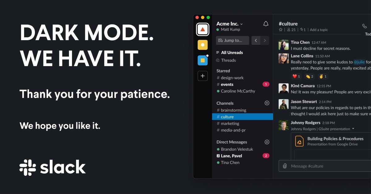
- Slack: The communication platform offers a beautiful and functional dark mode that enhances readability and reduces eye strain.
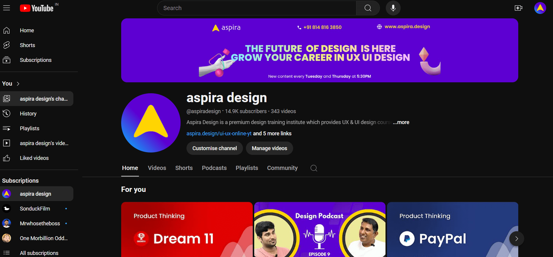
- YouTube: YouTube’s dark mode creates a more immersive viewing experience, particularly when watching videos in low-light environments.
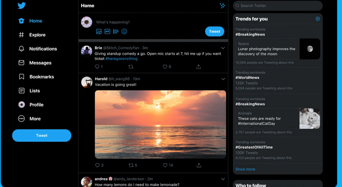
- Twitter: Twitter’s dark mode provides a sleek and modern look, making it easier to focus on the content.
Conclusion: A Brighter Future for the Dark Side
Dark mode design is no longer a trend; it’s a user-centric approach that enhances accessibility, comfort, and aesthetics. By understanding its benefits, implementing best practices, and learning from successful examples, UX designers can create interfaces that truly thrive in the dark. So, embrace the dark side – it might just lead to a brighter future for your users’ digital experiences.